
In today’s digital landscape, where mobile devices account for over half of all web traffic, having a responsive website is no longer just an option—it's a necessity. Responsive web design (RWD) ensures that websites adapt to various screen sizes and resolutions, providing a seamless user experience regardless of the device being used.
In this ultimate guide, we will explore the fundamental principles of responsive web design and how India’s leading web design experts are crafting stunning, mobile-ready sites that cater to the needs of modern users.
What Is Responsive Web Design?
Responsive web design is an approach that allows web pages to render well on a variety of devices and window sizes. The core idea is to create a single website that adjusts its layout and content according to the screen size, rather than developing multiple versions of the same site for different devices.
Key Principles of Responsive Web Design
1. Fluid Grids: This involves using relative units like percentages instead of fixed units like pixels. A fluid grid allows elements on a webpage to resize according to the width of the viewport.
2. Flexible Images: Just like fluid grids, images should also adjust to different screen sizes. By using CSS techniques, images can scale within their containing elements without losing quality.
3. Media Queries: These are a crucial component of RWD. Media queries allow the application of CSS styles based on specific device characteristics such as width, height, or orientation. This ensures the website looks great on desktops, tablets, and smartphones alike.
The Importance of Responsive Web Design
Having a responsive web design is critical for several reasons:
👉Improved User Experience: A mobile-friendly site enhances user satisfaction, leading to lower bounce rates and higher engagement levels.
👉SEO Benefits: Search engines prioritize responsive websites in their rankings. Google recommends RWD, making it essential for effective SEO strategies.
👉Cost-Effectiveness: Instead of maintaining multiple versions of a website, a responsive design offers a single solution that saves time and resources.
👉Future-Proofing: With the rapid advancement of technology, a responsive website is more adaptable to new devices and screen sizes, making it a future-proof investment.
Read More: How Responsive Design Is Changing the Future of Web Design in India
How India’s Leading Experts Create Stunning, Mobile-Ready Sites
India’s web design landscape is rich with talent, with numerous agencies and professionals specializing in responsive web design. Here’s how they elevate their designs:
1. In-Depth User Research
Leading experts begin with comprehensive user research to understand their target audience better. This involves analyzing user behavior, preferences, and the devices they use. Armed with this knowledge, designers can create a more tailored experience.
2. Focus on Minimalism and UX/UI Design
Simplicity is key in responsive design. Top-notch designers in India prioritize clean layouts, intuitive navigation, and appealing aesthetics. They often adopt a minimalistic approach that emphasizes functionalities while ensuring that visual elements engage users effectively.
3. Utilization of Modern Frameworks
The use of modern front-end frameworks and libraries, such as Bootstrap or Foundation, helps streamline the responsive design process. These tools offer predefined classes and components that facilitate quicker development without compromising quality.
4. Performance Optimization
Mobile users demand fast-loading websites. Leading web design experts in India put a strong emphasis on performance optimization. This includes compressing images, minifying CSS and JavaScript, and utilizing content Delivery Networks (CDNs) to ensure a seamless experience across devices.
5. Consistent Testing
To guarantee that a website truly is responsive, top designers conduct extensive testing across various devices and browsers. This multi-device testing phase is crucial to identify any discrepancies in design or functionality and rectify them before the website goes live.
Read More: Are You Losing Customers Because of Your Website? Here’s Why You Need a Responsive Design
Choosing the Right Responsive Web Design Company in India
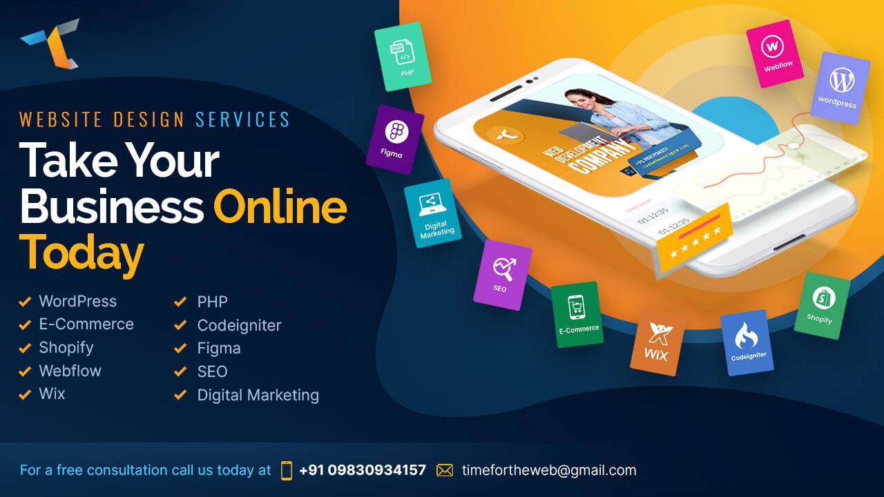
When selecting a partner to help you create a mobile-ready site, consider companies like Timefortheweb. Known as a leading Responsive Website Design Company in India, Timefortheweb specializes in creating dynamic and immersive websites that cater to diverse business needs. Their team of experienced designers and developers understand the nuances of responsive design, ensuring your website stands out in today's competitive environment.
Factors to Consider When Choosing a Design Company
1. Portfolio and Experience: Review the company’s previous work to assess their design style and expertise.
2. Client Testimonials: Take note of feedback from previous clients. Positive testimonials can help gauge a company’s reliability and service quality.
3. Customization and Collaboration: Ensure the agency offers custom solutions and values client input. The best designs emerge from collaborative efforts.
4. Support and Maintenance: Consider whether the company provides ongoing support and maintenance after your website goes live. This is critical for keeping your site updated and secure.
Conclusion:
Responsive web design is essential for any business wanting to thrive in today's digital age. By investing in a mobile-ready site, companies not only improve their user experience but also enhance their SEO efforts and reach a broader audience. Whether you’re a startup or an established enterprise, collaborating with a Responsive Website Design Company in India like Timefortheweb can empower you to create a website that is not only beautiful but also responsive and functional across all devices. Embrace the future of web design today and watch your online presence flourish!